Use the XMR Chart Function
You can use the XMR Chart function to calculate a central line that remains constant. The central line is utilized to monitor the consistency and fluctuation of a process over a period of time. It comprises two distinct charts:
- Individual (X) Chart: Used to trace individual values.
- Moving Range (MR) chart: Used to observe the variation between consecutive measurements.
User Scenario
Review the following scenario for the XMR Chart function. Then, you will simulate PLC data and calculate the central line.
In a pharmaceutical production plant, consistent dosage in pill manufacturing is paramount for patient safety and regulatory compliance. High-precision scales measure the weight of individual pills, with data points collected at regular intervals.
The XMR Chart function is integral to this process, providing real-time monitoring of dosage weights. By establishing a central line from initial measurements and calculating moving ranges, the plant ensures each pill is within the stringent weight specifications.
Step 1: Add a Device
Follow the steps to Connect a Device and configure the following parameters:
- Device Type: Simulator
- Driver Name: Generator
- Enable Alias Topics: Select the checkbox.
Step 2: Add Tags
After connecting the device, add the following tags. See Add Tags to learn more.
Tag 1: input1
- Name: Select S - Random value generator
- Value Type: Select float64
- Polling Interval: Enter 1
- Tag Name: Enter input1
- Min_value: Enter 101
- Max_value: Enter 199
Step 3: Create Analytics Flows
You can now create the analytics flows using data from the device and tag you previously created.
To create an analytics flow with the XMR Chart Processor function:
- In Manufacturing Connect Edge, navigate to Analytics.
On the analytics canvas, click Add processor. The Create a processor dialog box displays.
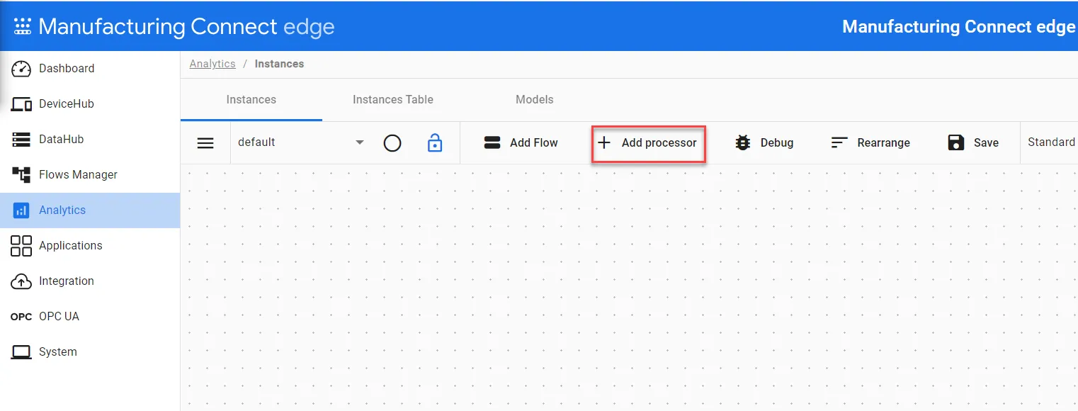 The Add processor option
- Select DataHub Subscribe.
In the Topic field, click the Search icon, select the device you previously created, and then select the alias topic for the input1 tag.
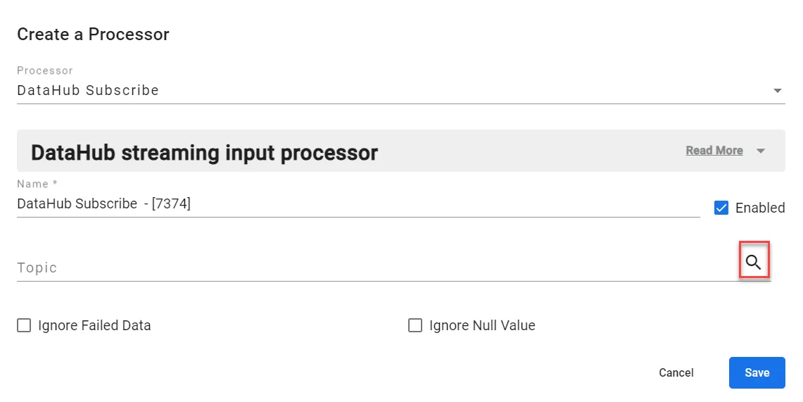 Create a Processor dialog box
- Click Save.
- Click Add processor again and select the XMR Chart processor. The Edit a Processor dialog box appears.
- Window Size: Enter a value that represents the range to apply the XMR chart function. For this example, we input a value of 100.
- Process Limit Multiplier: It is used to calculate the upper and lower process limits. For this example, we input a value of 2.66.
- TimeInterval: If you know your input is going to publish at the expected interval, it is better to disable this timer by entering 0 in the field.
Click Save.
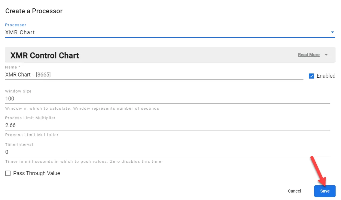 Edit a Processor dialog box
- Connect the DataHub Subscribe processor (tag: input1) to the XMR Chart processor with a wire and use the events connection.
On the analytics canvas, click Save. The configured analytics flows should look like the following:
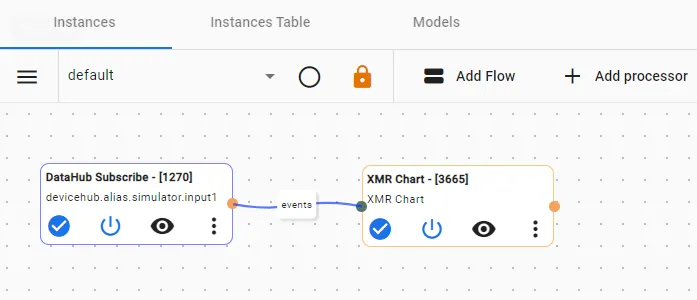 Completed Flows Canvas
Step 4: View Output of Processor
Click the View icon in the XMR Chart processor to view the output values.
The output of the XMR Chart function shows a central line at 101, with an upper process limit of 101 and a lower process limit of 101.
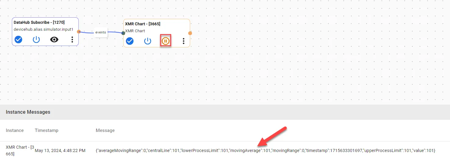
Once the window is filled, other fields that are calculated as follows:
- Moving Ranges: Difference of successive values.
- Average Moving Range: Average of the moving ranges.
- Process Limit Multiplier: Calculates the upper and lower process limits.
- Upper and Lower Natural Process limit: Calculated by taking the product of process limit multiplier and average moving range, and adding/subtracting it from the central line.
In some cases, the central line is adjusted. Here are the cases:
- If current value is outside the process limits multiple times in a row.
- If the multiple values in a row are closer to either limit than they are to the central line.